IoT Network Management Dashboard
React admin console for a 70,000+ device fleet — live status, telemetry charts, and role-aware tools for operators and support, not a spreadsheet of every device.
Technologies
- React
- Redux
- TypeScript
- Bootstrap
- Chart.js
- WebSocket
- D3.js
- Node.js
- Express
- PostgreSQL
- Redis
- Socket.IO
Key Achievements
- Operator console for a 70,000+ device fleet
- Live status and telemetry without polling the whole estate
- Role-based access for admins, support, technicians, and customers
Project Links
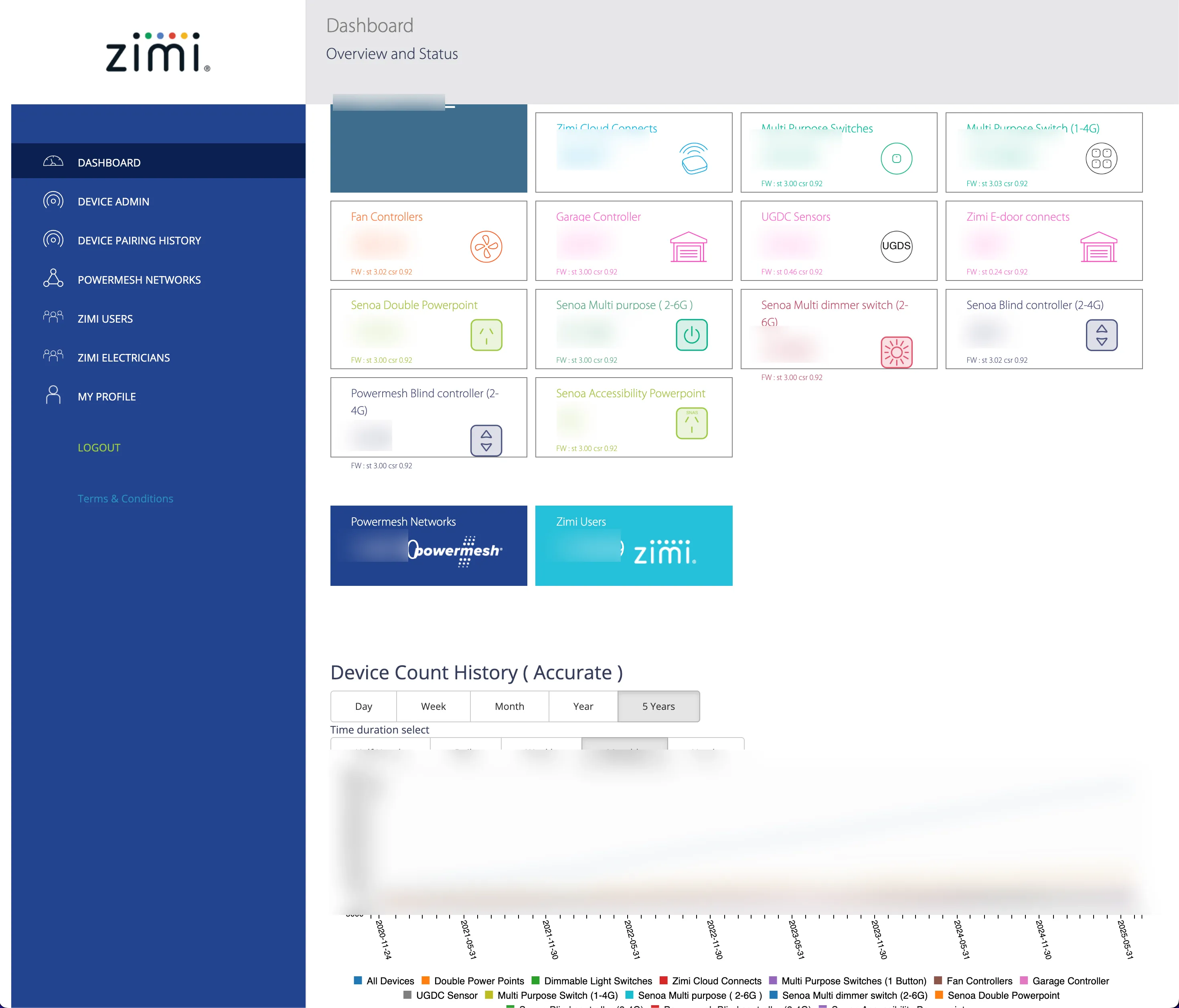
The admin console is the human face of the Zimi IoT platform. I built it in React, Redux, and TypeScript so operators, support, and field technicians can see device health, telemetry, and usage without SSHing into anything. It is one container in the C4 model, sitting on the same APIs as the rest of the backend.
Operators cannot stare at 70,000 rows
A fleet that size is not a table you sort. Most devices are fine most of the time. The job is the exceptions: a gateway that stopped talking, a network with a high error rate, a device whose power draw looks wrong, a customer who says “the switch does nothing.”
The other audience problem is mixed. Admins configure the system. Support needs one household, fast. Technicians need status in the field, on a phone. Customers should see only their own devices. One UI with no roles would have leaked data or drowned people in the wrong knobs.
And the data is chatty. Telemetry and connectivity events arrive continuously. If the browser subscribed to everything, it would fall over; if it polled everything, the API would.
What changed
The console is a set of questions, not a fleet dump:
- Which devices or networks are unhealthy right now?
- Where is this device, and when did it last talk?
- What has it done in a chosen window?
- How is this household using power and loads over time?
- Who is allowed to change what?
An interactive map sits next to the lists: location plus live status, so support can see a silent gateway in a suburb instead of hunting a serial number. Status itself is last-seen, connectivity, and — for wireless devices — battery. Those three answer “is it even reachable?” before anyone opens a telemetry chart.
Lists and the map share the same filters: device type, location, status, and a date range for history. Paginated, and virtualized where a list can still get long. Charts use Chart.js for the usual time-series KPIs; heavier custom views use D3 when a stock chart is the wrong shape. Redis sits behind the API so common lookups are not a database round-trip every time an operator opens a page.
Live updates go over WebSockets for the things that actually change while someone is looking: online/offline, last-seen, battery, in-progress commands. Historical charts load over REST for a time range. That split keeps the socket from becoming a second copy of PostgreSQL.
Access is role-based. Admin configuration, support tooling, technician read-only status, and customer-scoped views share components but not data. Actions are audited.
The UI is usable on a phone because a lot of the work happens in a switchboard or a hallway, not at a desk.
Live where it matters, aggregate everywhere else
The tempting design is “stream every register to the browser.” It looks impressive in a demo and dies in production.
What support actually needs is an aggregated health picture plus the ability to open one network and one device. Aggregation and indexing belong on the server. The client holds a window: current filters, a selected entity, a live subscription for that entity.
That also decides the Redux shape. Normalise devices and networks so a status event is one update, not a rewrite of a giant tree. Optimistic command UI is fine; the source of truth is still the backend event that comes back after the gateway reports.
I did not put machine-learning “predictive maintenance” in this console. Health is last-seen, errors, connectivity, and the telemetry we already store. Alerts come from those signals.
After
Operators can see fleet and household state without a site visit. Support uses telemetry and usage charts instead of guessing. The same role-aware APIs feed this UI and the rest of the platform.
Related: migration (the backend this talks to), C4 container view, data lifecycle for the history those charts read.